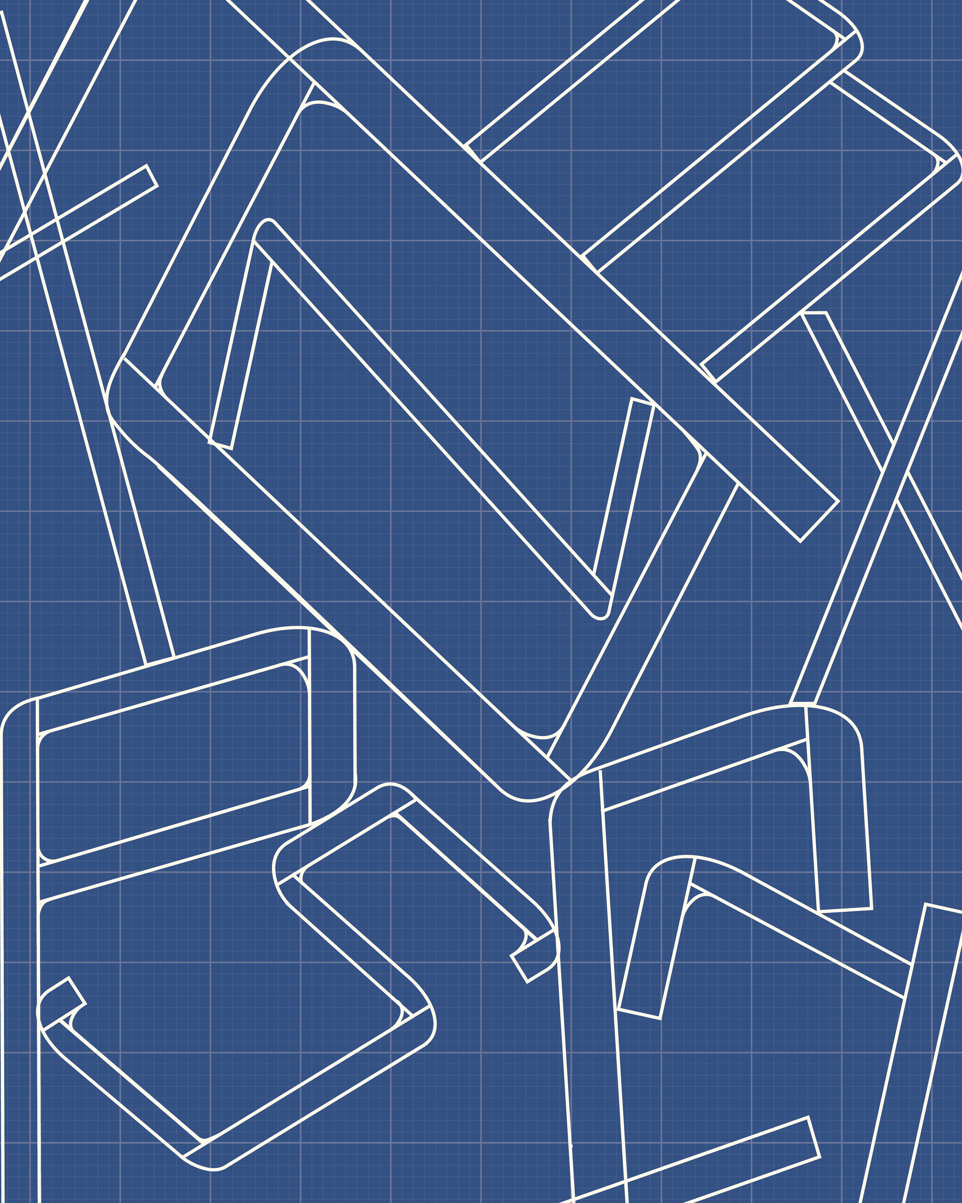
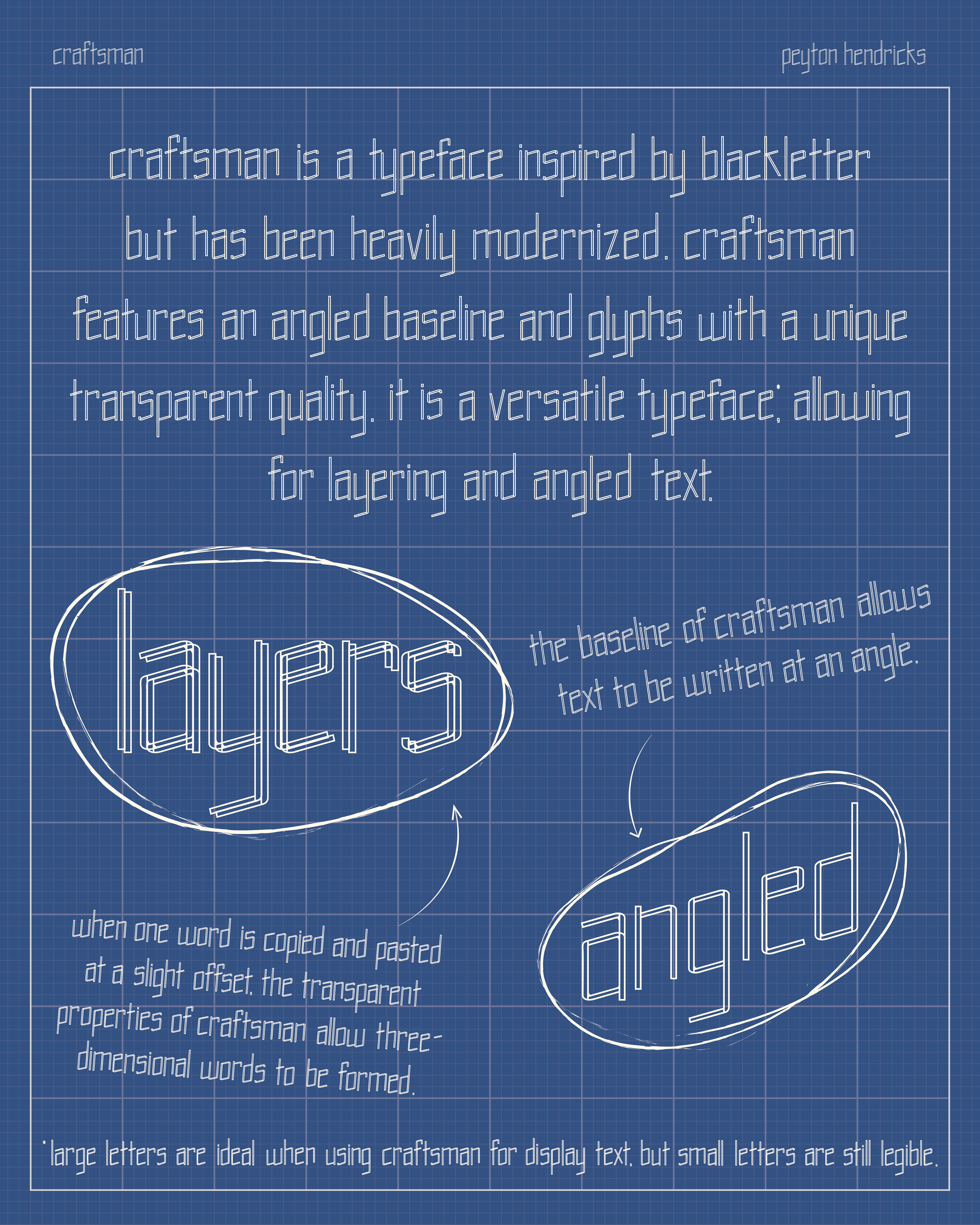
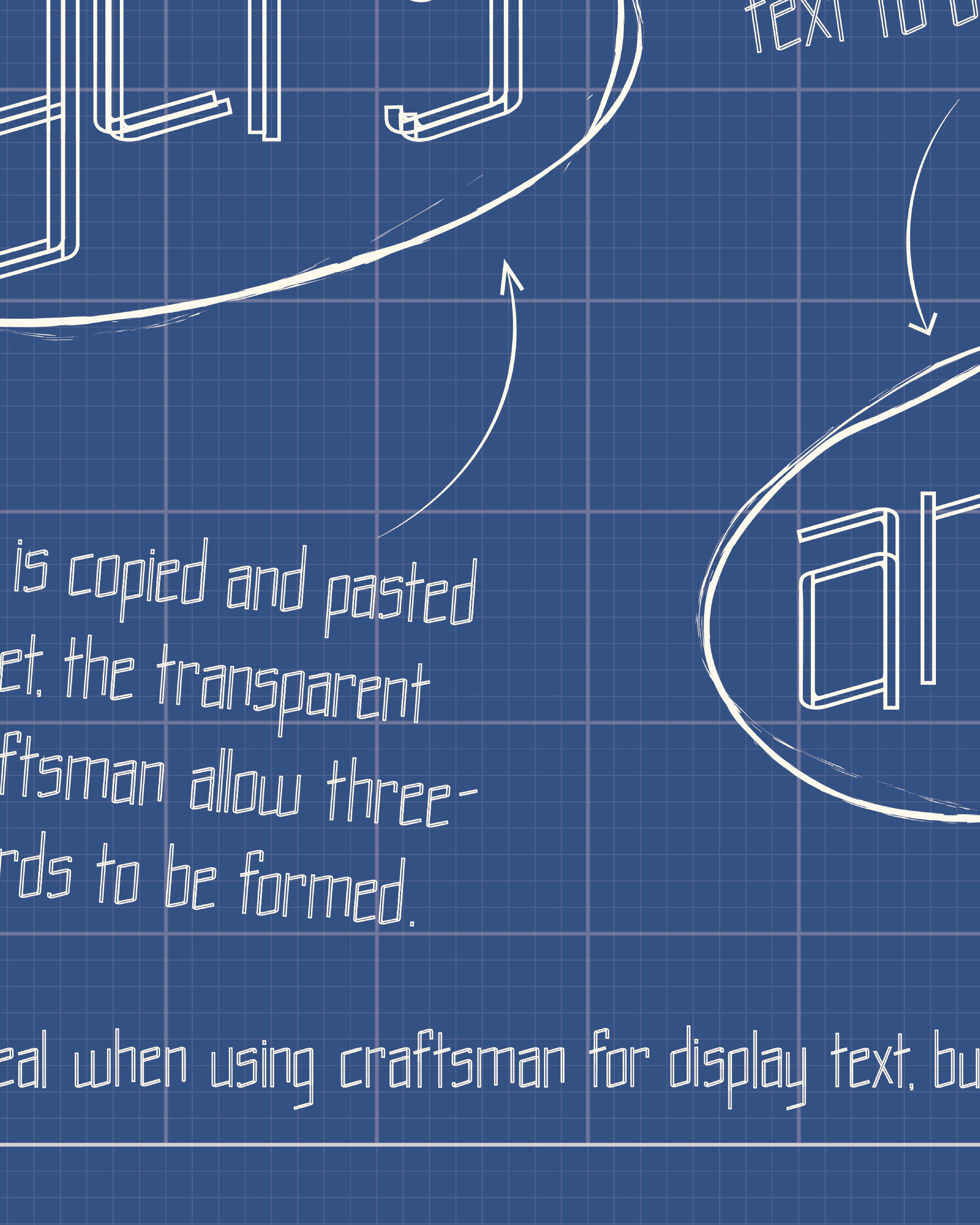
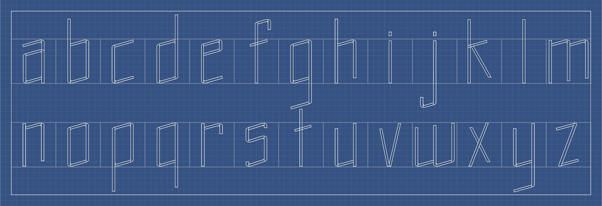
craftsman was handmade in Adobe Illustrator from scratch, based on modernizing blackletter. Each letter was also hand-placed, so I took a lot of care in making sure that my kerning and leading was done properly. This was my first go at creating a typeface, and even earned me an award.
In early 2022, I revisited this type specimen and gave it a bit of a facelift, which is pictured here!
A poster with a blue background reminiscent of the color of architectural blueprints. Also in the background, there is a grid of grey squares, also not unlike traditional blueprints. The lowercase letters, roughly from left to right, "t," "a," "z," "m," and "x," are on the top row. The letters, also from left to right,  "e," "s," "f," and a backwards "r" are on the bottom row. The "z" is within the bowl of the "a," and the letters "e," "s," "f," and "r" are underneath the rest of the letters. "x" is between the "m" and the "f" vertically. These letters from the craftsman typeface are asymmetrically placed in varying sizes and at different angles.
A poster with a blue background reminiscent of the color of architectural blueprints. Also in the background, there is a grid of grey squares, also not unlike traditional blueprints. This side of the poster also has a larger box around all of the text, excluding "craftsman," which is located in the top left corner above the main block of text, and "peyton hendricks," which is located on the right side. The main block of text reads as follows: "craftsman is a typeface inspired by blackletter, but has been heavily modernized. craftsman features an angled baseline and glyphs with a unique transparent quality. It is a versatile typeface,* allowing for layering and angled text."  Underneath this block of text on the left side, the word "layers" is circled with an arrow pointing from a block of text below to it. "When one word is copied and pasted at a slight offset, the transparent properties of craftsman allow three-dimensional words to be formed." Next to this text, on the right side of the image, the word "angled" is circled with an arrow pointing to it from a block of text above it. "the baseline of craftsman allows text to be written at an angle." at the bottom of the page, a footnote is written. "*large letters are ideal when using craftsman for display text, but small letters are still legible."
A close-up of the previous image to show detail.
Back to Top